Automating sourcing
Product Design
Prologue
Prologue
Prologue is a new kind of ATS that puts your candidates at the centre of hiring efforts. Prologue is the software for the candidate-first hiring movement.
Background
Customer feedback revealed a common challenge: acquiring quality candidates. This hindered both customer acquisition and growth.
Research
Conducted without a dedicated budget, I engaged prospects through LinkedIn outreach and customer catch-ups in Slack. Insights were documented in Notion, revealing three key sourcing approaches for existing users and prospects.
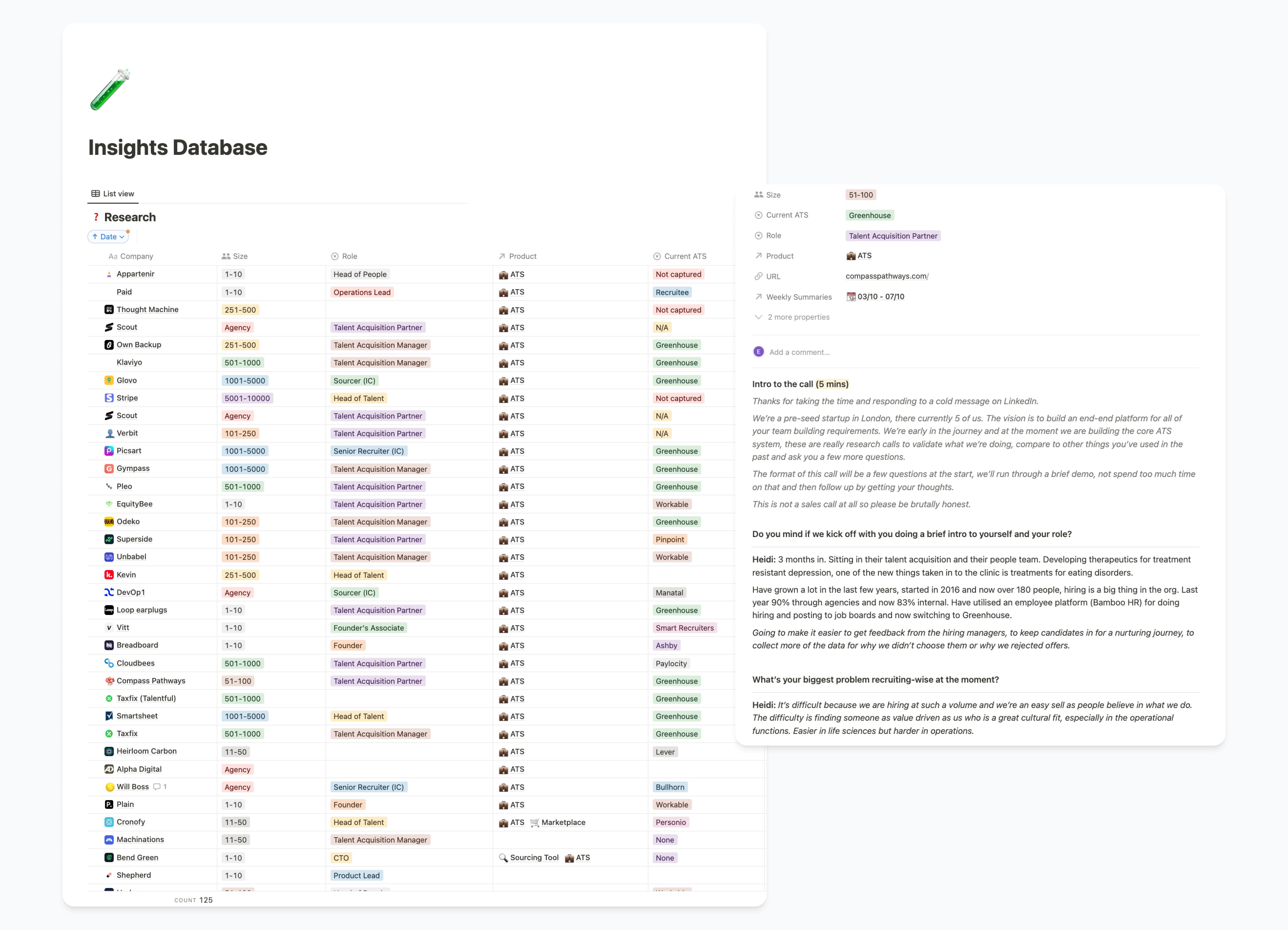
Employing external recruiters
- 20% fees on placement and often a retainer of £2000 upfront
Manual sourcing
- Slow and hard to do well without spending money on expensive LinkedIn Recruiter licences
Posting jobs on multiple boards
- Initially cheap but hiring managers and internal recruiters need to sift through mountains of applications to find the candidates they want to interview.
- Previously addressed with the introduction of application reviews
Ideation and Scoping
Through ideation sessions a solution emerged: an AI-powered recruiter. I ran scoping sessions with the team to define the project’s scope and approach.
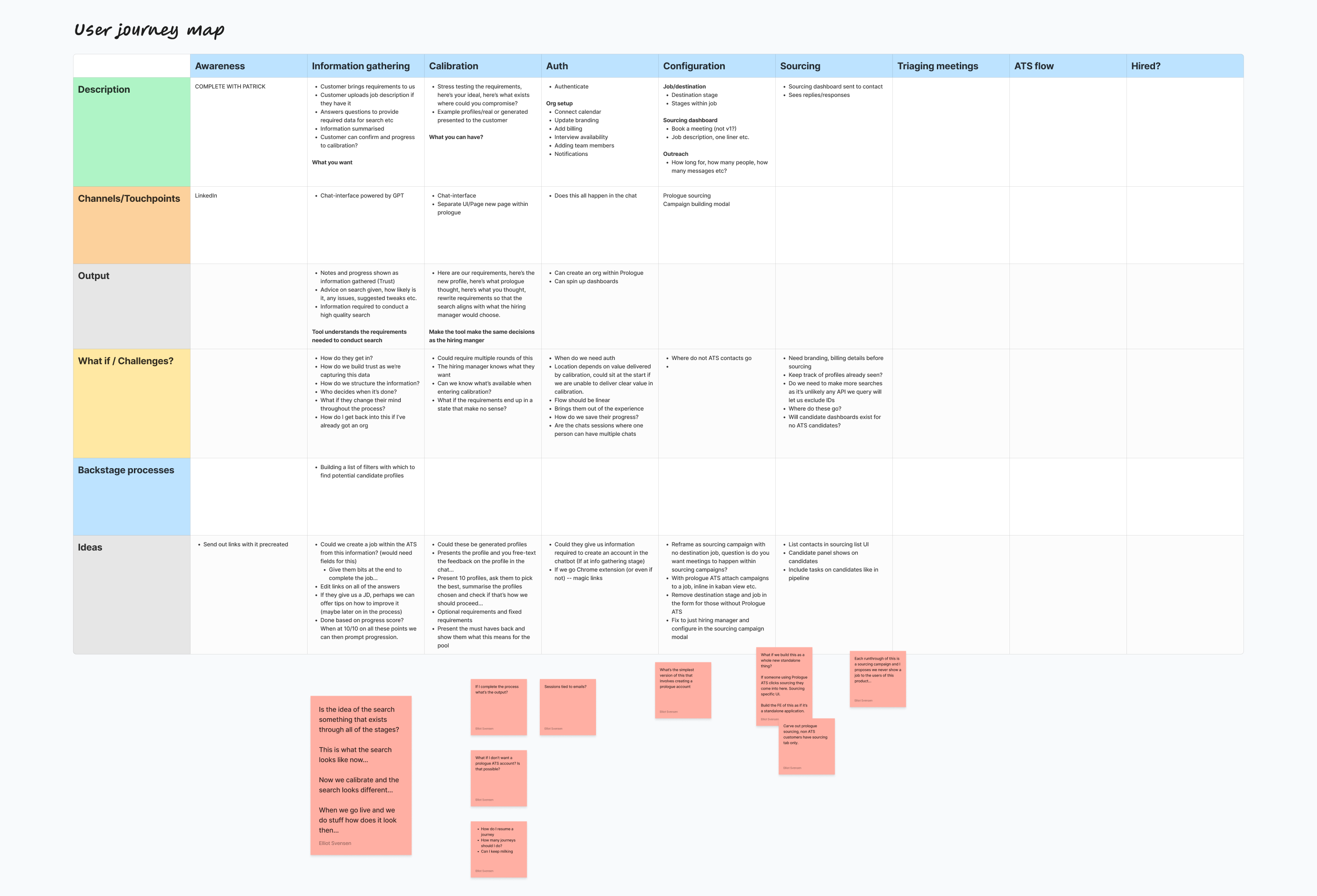
Objective
Deliver the first iteration of the AI recruiter with the following UX outcomes:
- Streamline the process of reviewing and reaching out to suitable candidates.
- Enable candidate responses and meeting scheduling.
Business Objectives
- Generate new business by expanding our service offering.
- Enhance customer accounts and improve retention.
Challenges
- Balancing API costs for the third-party service and GPT requests.
- Managing users expectations and keeping them engaged while we carry out work behind the scenes.
- Integrating this with the existing product.
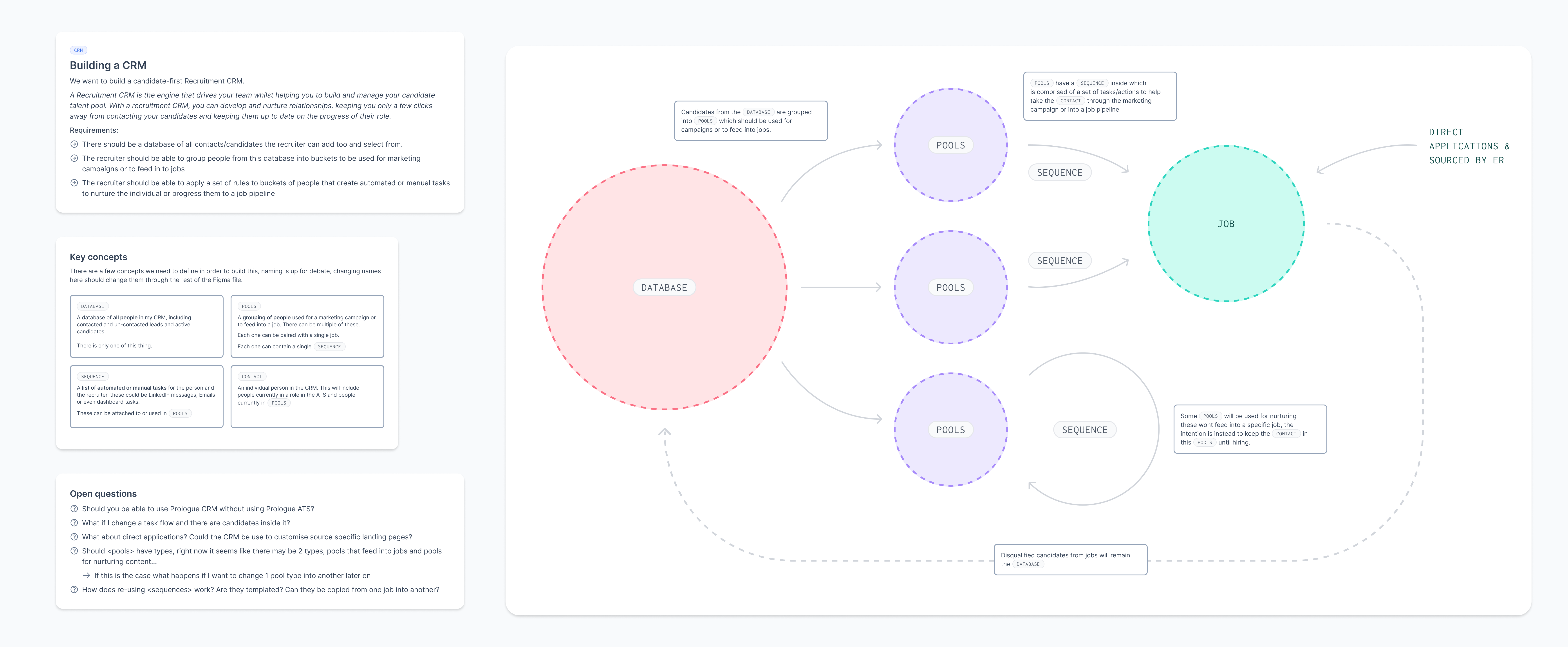
Mini Project: Building out a Basic CRM
To integrate the AI recruiter, a basic CRM was needed. I reviewed competitor flows, and some of the engineering team initiated work on this while the rest of us continued work on the AI recruiter.
The AI Recruiter
I started mocking up some flows, first on paper and then in Figma with components from the design kit I’d implemented previously.
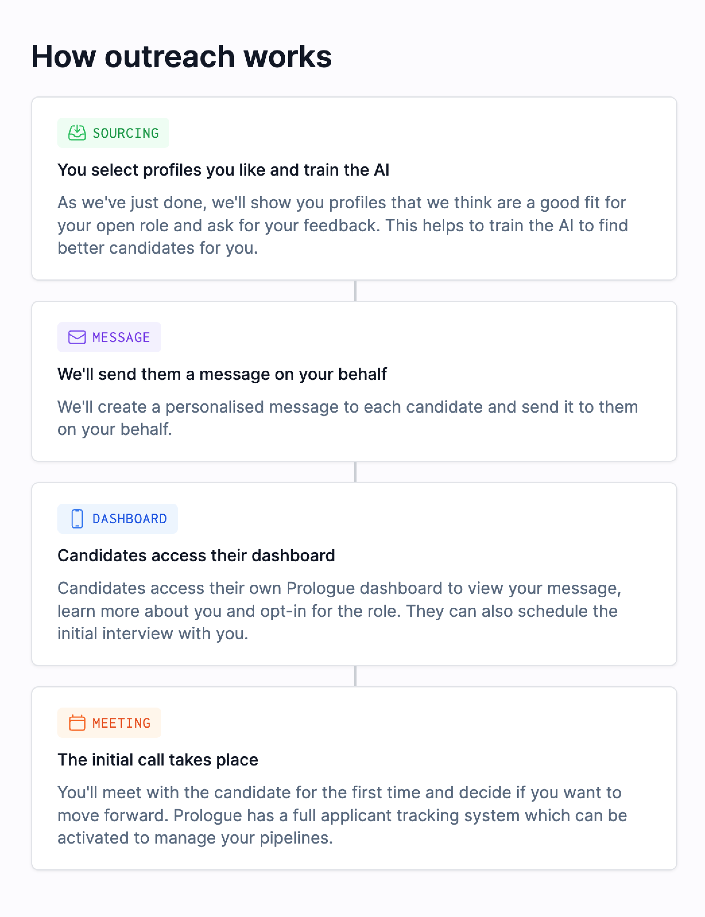

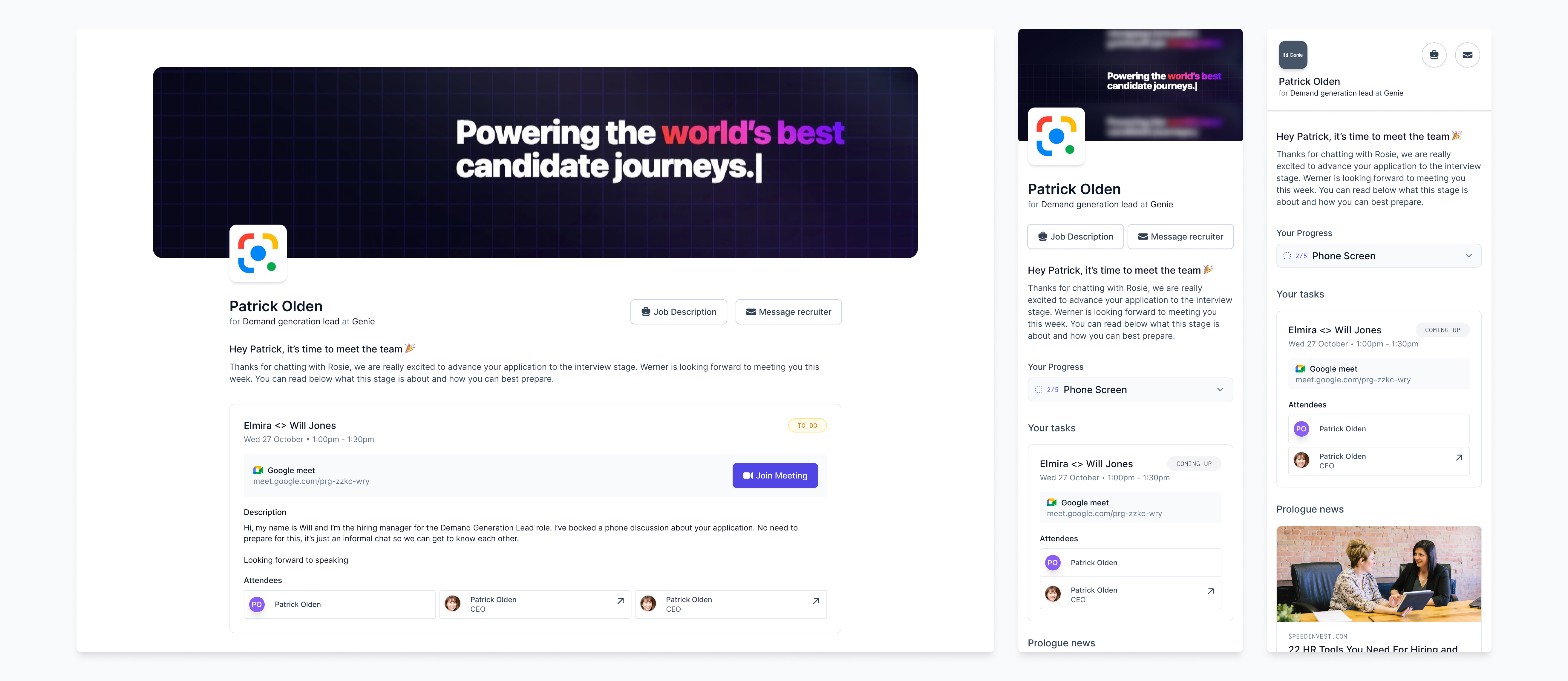
Working with engineers we implemented the basic flow, and after some QA I took it into research calls and invited a selection of previously engage prospects to try it out.
Rough Usability Testing & Insights
We set up tracking using openreplay and logging in new relic and a sales tool, I’d review all sessions each morning and see where we were encountering issues.
Identified issues leading to a 43% onboarding churn rate.
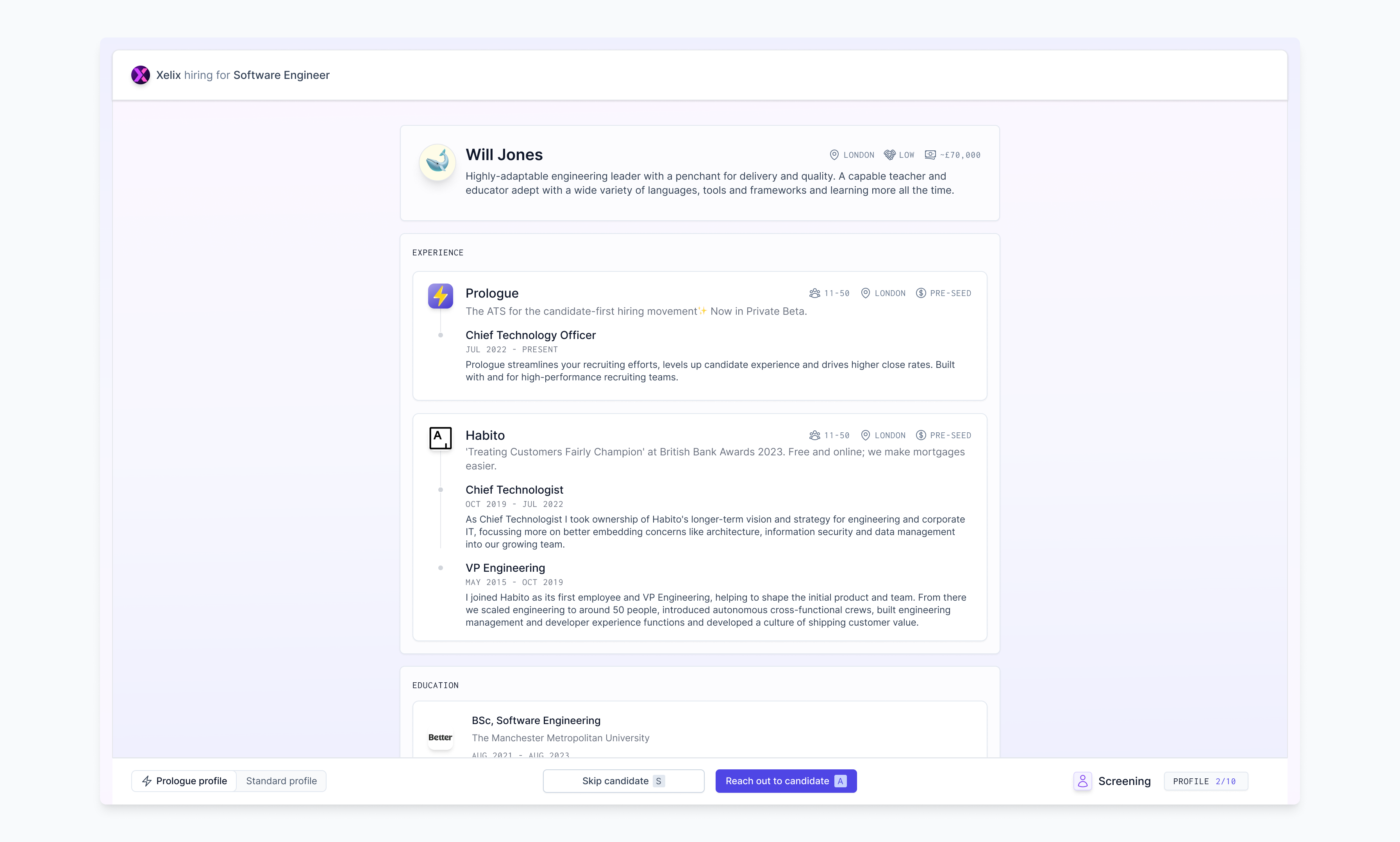
50% of all users who reached profiles during research calls were unimpressed by the profiles we were providing them with.
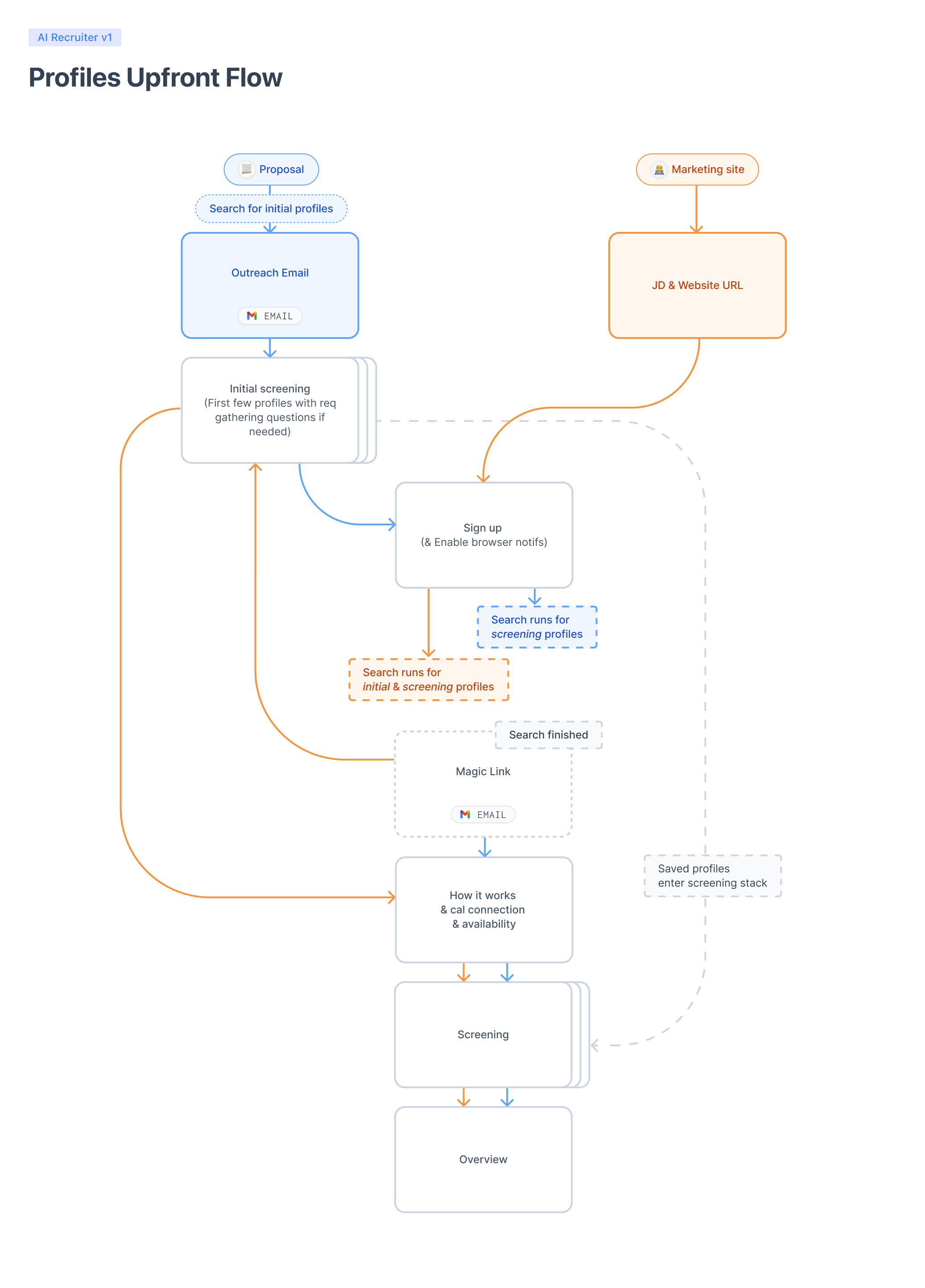
Users were hesitant to connect calendars before seeing proof of the tool’s efficacy.
This project was massive and underwent constant rapid iteration, to keep it condensed I’ve highlighted a few of my favourites here.
Async onboarding
Transitioned to asynchronous onboarding, collecting job descriptions upfront and emailing users once profiles were ready.

Condensed account creation
Reviewed and condensed all information required to create a new account, moved unnecessary information into a helper after account creation.

Visual Design
As we were getting closer to something viable I revised all designs and updated our design kit.
Measuring impact
We’re still iterating and shipping. Churn during initial onboarding has reduced to 20% and qualitative insights from users are more positive.
Learnings
Working with AI was new territory for most of the team, in hindsight we should have built something isolated from our existing product initially, this would have reduced the build cost for each iteration.
Next Steps
Continued refinement and enhancement of the AI recruiter, addressing user feedback, and exploring opportunities for further innovation.